How I Choose a Color Palette for My Clients

Whether I'm designing branding or an entire website, one of the main things I have to choose is the color palette for each business.
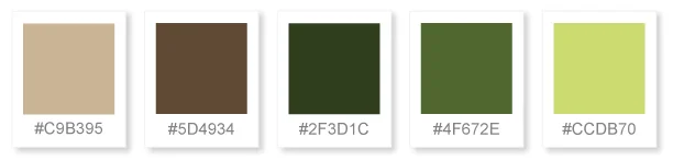
If you search online, there are tons of color palette generators and samples you can choose from. But it's about more than just looking pretty or following the current trend: it's about using your color palette, just like the rest of your visual brand, to represent your business and what makes it unique.

Brand Considerations
Audience
One of the first topics I dig into with a client is about their audience. Knowing their audience inside and out allows me to create a visual brand that they can relate to. Every business owner has a feeling that they want to communicate, but translating that feeling into a color palette depends on knowing the psychology behind colors and how different people react to them.
Some people may see the color green and think about being outdoors and feel calm, while others may think of money and ambition. Understanding how different colors are going to affect your audience's mindset allows you to choose colors that convey the feeling you want without accidently communicating something that you don't want.
Each person perceives things differently. If I ask a client to describe the feeling they want their brand to have and they say "luxurious" I have to dig deeper into what that means for them. Luxurious could be deep hues with gold in a swanky hotel or it could mean curling up under a blanket in a mountain cabin for rest and relaxation. Those two ideas would look totally different and if I don't know which they mean, I can't create a color palette that feels luxurious to them.
Brand History
This is a little more clear-cut. If I'm working with a brand that already has an established color palette, I always take that into consideration. Some may want to stick with some signature colors, but clean everything else up. Others may want to have a fresh start and not use any of the previous colors associated with the business.
This can be influenced by a variety of factors: change in management, changing audiences or focus, shedding an outdated image, or even personal preference. Neither is wrong, but it does help to understand why a client wants a new color palette and the goal behind it.
Color Preferences
Everyone has colors that they are naturally drawn to and others that they really don't like. Even though a business's visual content is geared to its audience, no one wants a color palette that they hate looking at. I take any color preferences into account at the beginning of the process and use those to help develop the rest of the brand around them.
Color Theory
You can use color theory to help you create a color palette that works well together based on color principles and not just on instinct. Below is a brief overview of color theory and the color schemes that it can create.
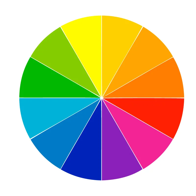
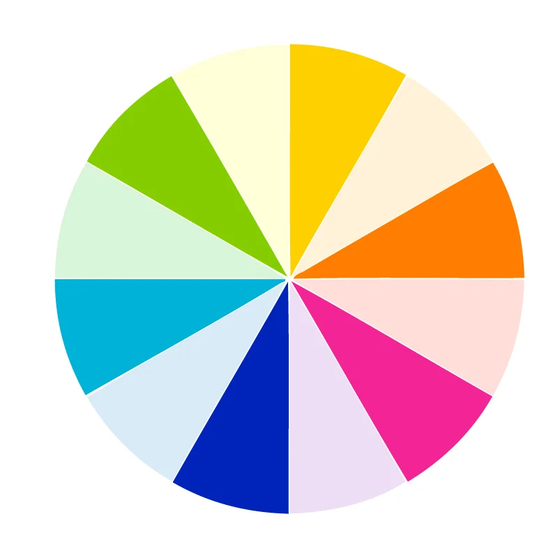
The Color Wheel
The basic color wheel is made up of 12 different colors that contain the full spectrum of colors that humans can see. You can use the color wheel to see color relationships and then base your color palette on those relationships.
Primary Colors
Red, Yellow, and Blue
Secondary Colors
Orange, Purple, and Green
(made from combining primary colors)
Tertiary Colors
Yellow-Orange, Red-Orange, Red-Violet, Blue-Violet, Blue-Green, and Yellow-Green
(made from combining a secondary color with the primary color next to it)
Common Ways to Use Color
There are common ways that you can combine colors to create a palette for your brand.
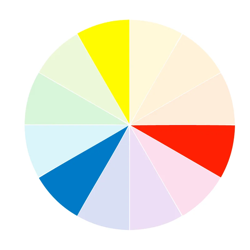
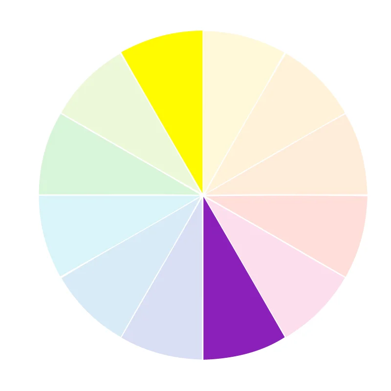
Analogous
Created using between two and six colors next to each other
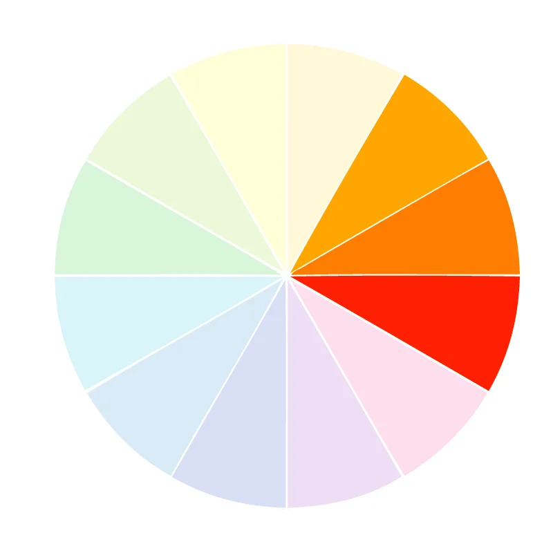
Complementary
Opposites on the color wheel provide high contrast

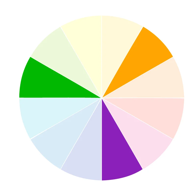
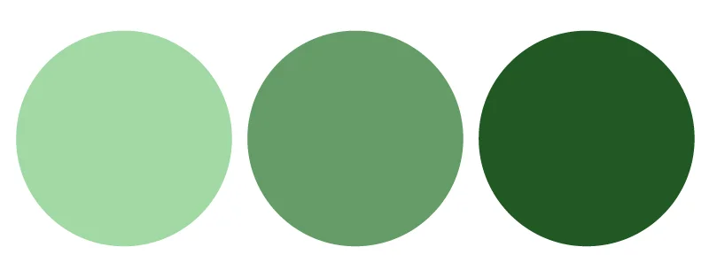
Monochromatic
The same color in steps from light to dark
Color Dimensions
Color palettes can also be created using various dimensions of one color.

Hue
the pure color
Tint
created by adding whit
Tone
created by adding gray
Shade
created by adding black
Color Meaning
Each color has a meaning and a feeling that it conveys to your audience. This can vary based on the type of people you're reaching, but generally using the meaning of a color to help you determine a color scheme can help you create the feeling you want your brand to have.
Red: energy, war, danger, strength, power, determination, passion, desire, love
Orange: joy, vitality, optimism, enthusiasm, confidence, courage
Yellow: joy, happiness, intellect, energy, impatience, criticism
Green: growth, harmony, freshness, fertility, possessiveness, balance
Blue: depth, stability, trust, loyalty, wisdom, confidence, intelligence, faith, truth, heaven
Violet: royalty, power, nobility, luxury, ambition, creativity, wisdom, magic
White: light, goodness, safety, purity, cleanliness, innocence, wholeness, completion
Black: power, elegance, formality, death, evil, mystery
Creating Your Palette
Even with all of this information, it can be overwhelming to try to create your own color palette. If you're struggling to create the feeling that you want, I suggest searching for color palettes on Pinterest or Design Seeds and take your inspiration from there. You can also use a photograph that you love and pick out the colors from it.