Free Website Design Audit for Health & Wellness Practices
Your website is often the very first impression potential clients have of who you are and how you can help them. In today’s competitive market, a beautiful website isn’t enough. Every element of your homepage must be strategically designed to attract the right audience, build trust, and guide visitors toward taking action.
A high-performing homepage goes beyond just looking good. It communicates your unique value, addresses your clients’ specific challenges, and offers a clear path for them to connect with you.
Is your homepage truly working for you? Discover the 14 essential elements that make sure your website shows up on Google, generates leads, and converts more clients (including exactly what content you need to include on your homepage and how to lay it out).
Start with the Basics
Before you start working on creating or updating your website, you need to start with the strategy behind it. A pretty website isn’t going to work if it isn’t designed to attract the right people, move them towards working with you, or if no one can even find it.
1. Identify Your Target Audience and Decide on a Clear Call-to-Action
The first thing you need to know is who you want to work with and what you want them to do on your website. This will help you to write copy that resonates with your ideal client and create a strategy that makes it easy for them to take action.
Ask Yourself: Do you have a clear niche in your industry and a defined goal for your website visitors?
Even if you aren’t niching down to a specific type of client or modality, you can find commonalities between the clients you love working with that allow you to speak directly to their struggles and desires.
This also allows you to decide on which pages you need on your website, that questions you need to answer in your content, and where to direct people as a next step.
How to Lay Out Your Homepage
The following 9 points walk through the exact sections you need to have on your website’s homepage and how to use each to resonate with your ideal clients. Each section includes an example of what this can look like on your website.
2. Use a Transformative Headline
Instead of a generic headline that says nothing about what you do or who you help, your headline should tell me what you do, who you do it for, and why I should choose you over every other practice.
Ask Yourself: Is your headline focused on the transformation you offer or your clients' struggles in their words?
Try asking your favorite clients why they decided to work with you or what made them decide it was time to get help. Then get specific using their words.
Instead of “feel better now” try “get rid of your anxiety without relying on medication”
Instead of “revitalize your health” try “wake up refreshed every morning”
Instead of “get the results you deserve” try “enjoy time with your kids without pain”
Learn how to write a headline for your practice that shows up on Google.
3. Let Your Sub-Heading Answer Questions
The goal of your headline is to capture attention and let visitors know that they’re in the right place. The goal of your sub-heading is to expand on exactly what you do, who you work with, and where you’re located.
Ask Yourself: Does your sub-heading include the service you offer, who your target clients are, and your location?
Sub-headings like “A Child-Centered Approach to Pediatric Speech, Occupational, & Feeding Therapies and ABA Services in Northern New Jersey,” we create a plan to help your child find the place where they will thrive,” or “Botox, Wellness & Weight Loss in Chesterfield and Petersburg, VA” make it clear that someone can hire you for exactly the services they’re looking for.
4. Have a Clear Call-to-Action
This section of your website is one that many people forget because they already have a button in their menu or at the end of the page, but you need to have a call to action button in the hero section of your website under your sub-heading.
Ask Yourself: Is there a clear call-to-action button immediately following your sub-heading?
Choosing the Best Call to Action for Your Website
The best call to action for your website is going to be the one that makes sense for your ideal client and the service you offer.
If you have a service with a high price point or that is a long-term commitment, you’ll want to use something like "schedule a free consultation” or “let’s chat about it.” This should link to an online calendar where they can book a time to talk with you.
If you have a more standard offer type with regular appointments booked as needed, the best option is going to be “schedule now” or “book your appointment now” with a link to an online scheduler through your EHR.
If you want visitors to take another type of action like joining your email list or purchasing a low-cost course, your calls to action should use clear language to tell them exactly what will happen when they click.
What it Might Look Like
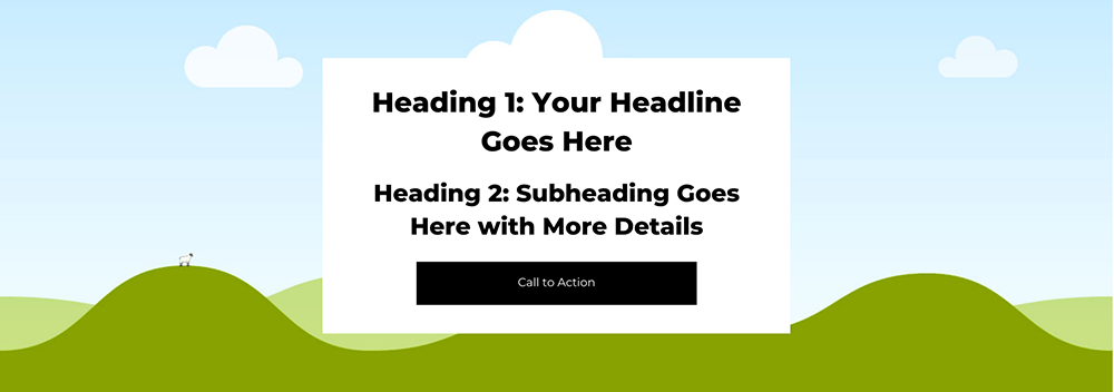
Example hero section including a transformative headline, subheading, and call to action button.
5. Share What Makes You Different
With so many options for the same type of service, people are deciding who to work with based on if they can connect with the practice and feel seen and understood.
You’re not selling the modality that you work in - you’re selling why you’re the right person to help them.
Ask Yourself: Do you have a brief introduction to your business that showcases what makes you the person your ideal client should work with?
Share how you are the right fit for your ideal clients because you understand not only what they’re struggling with, but also the outcome that they ultimately want. You can also bullet point a list of struggles or symptoms.
What it might look like

Simple intro section that includes a headline and 1-2 paragraphs of text.
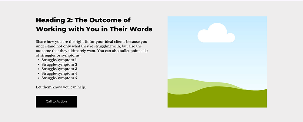
More detailed intro section that includes a headline, description, and bullet points highlighting your understanding of your client’s struggles or symptoms.
6. Let People Know How to Work with You
No one will hire you if they don’t know what you have to offer. Your homepage needs to highlight the different options for working with you, whether that is through different packages or services.
Ask Yourself: Are you sharing the services you offer or the ways you work with clients?
The “Choose Your Own Adventure” section is where you can share exactly how you work with clients to solve the problem and get the outcome you talked about in your headline and introduction.
This could look like listing 3 different modalities (like occupational, physical, and speech therapy) or different packages that you offer (like a membership, 1:1 appointments, or group programs).
This section is going to briefly introduce each and give people the option to learn more about the one they think is the right fit for them.
If you don’t have different modalities or service options, you can also use this section to highlight the different client types you work with (individuals, couples, and families) or the process that you lead them through to get results.
What it might look like
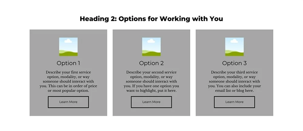
Choose Your Own Adventure section with 3 options for working with you.
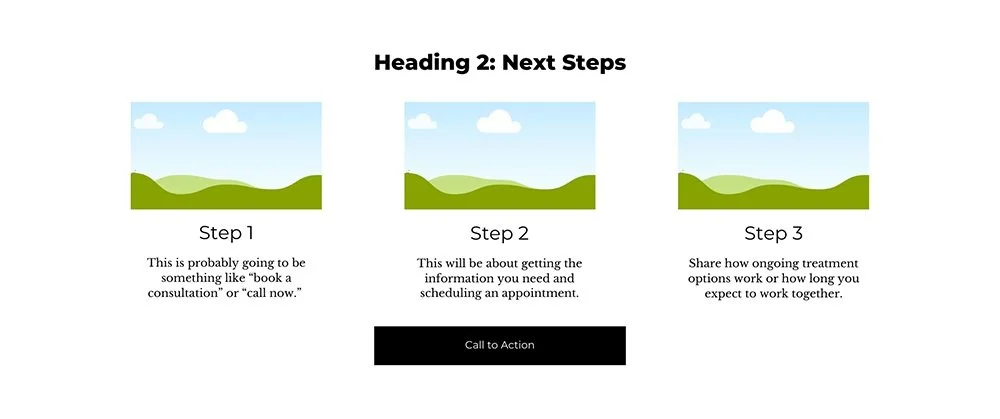
Choose Your Own Adventure section with your process, next steps, or types of clients you work with.
7. Include a Short Bio
If you’re a solo practitioner or a small practice, people are going to be working directly with you, which means they want to feel connected with you even before they book an appointment.
Ask Yourself: Is there a short bio that includes your name and an introduction to you?
Write a short bio about you as the primary practitioner. You should include your major credentials, information about what you love doing with clients, if you serve or have expertise in a specific area, and any special training. You can also include a few fun facts about you that could relate to your ideal client. Talk about your hobbies or family. Then invite them to schedule a consultation or appointment with you.
What it might look like
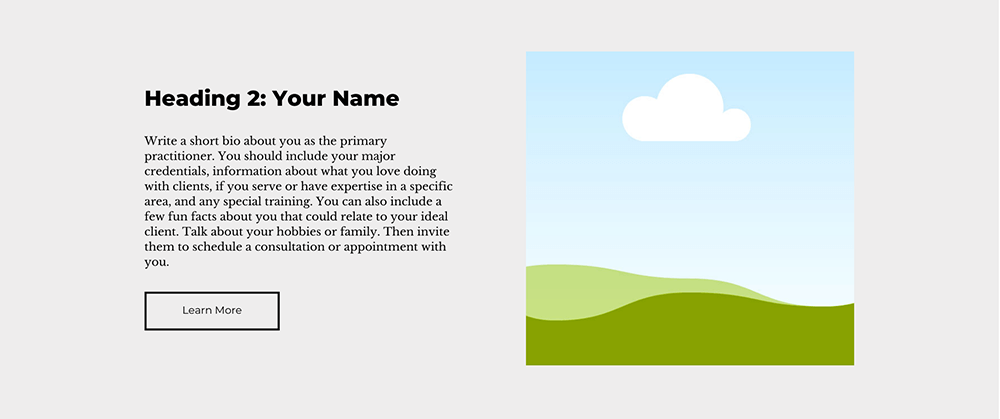
About or Bio section design example with a headshot, name, and 1 paragraph biography.
8. Educate Your Visitors with Blog Posts or Free Resources
A blog is still the best way to improve your website’s search engine ranking and it helps you showcase your expertise to people who visit your website, especially if they aren’t ready to hire you yet.
Ask Yourself: Do you have a section for your latest blog posts or free resources?
If you have a blog or any resources that you share with your email list, include a section on your homepage that includes either the most recent or most popular posts (or resources).
This gives your ideal client another chance to engage with you before committing to scheduling an appointment and it keeps visitors on your website longer, improving your bounce rate.
What it might look like
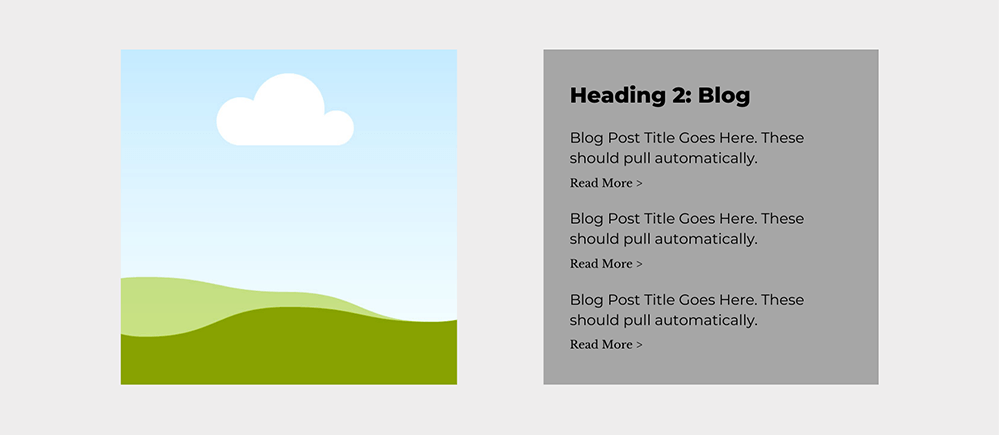
Blog section design featuring the most recent or most popular posts.
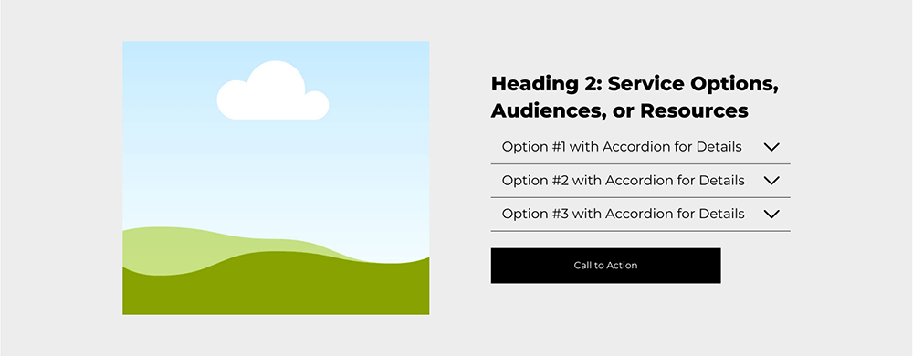
Resources, service options, or audiences section design featuring accordion drop-downs to share more details.
9. Always Have a Final Call-to-Action
If someone makes it to the bottom of your website, it means that they’re interested in what you do. Don’t add friction to their experience by making them scroll back to the top of your website to book an appointment.
Ask Yourself: Is there a final call-to-action above the footer that prompts visitors to take immediate action?
Keep this final section of your homepage simple with a heading, description, and button. I like to put these on a colored background or image to help it stand out and make it clear that this is what you want someone to do before they leave your site.
What it might look like

Final call-to-action section design to invite people to schedule an appointment or join and email list.
10. Take Advantage of Your Footer
Don’t underestimate the importance of your website footer. This is your last chance to help visitors find what they are looking for, like your contact details, services, and social media links, without having to search through multiple pages.
Ask Yourself: Does your footer include essential links and information, such as policies and contact details?
Elements you need to include in your website footer:
Your logo or business name
Links to main website pages (these should appear in the same order as on the main menu
Social media links (either text or icons)
Contact information including email, address, phone number, or link to contact page
Newsletter opt-in form
Copyright information
Link to policies
See some examples of how you can lay out your website footer.
What it might look like
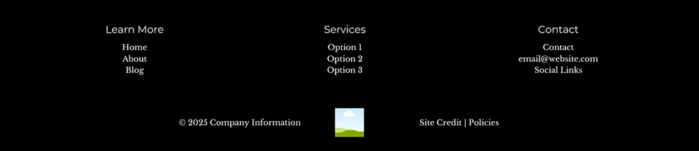
Footer design including important links, contact information, logo, policies, and copyright information.
Make Sure Your Website is Optimized
Even the best layout doesn’t help you grow your practice if no one can find or read your website. These final 4 areas are not the glamorous work of making a good looking website, but are just as important to generating leads and booking clients.
11. Check Your Website on Mobile
According to a report from Statista, 60% of website traffic was on a mobile device 2024. This can be even higher if you’re using social media as a primary marketing platform for your business.
Ask Yourself: Is your website optimized for mobile devices?
For practices in the healthcare space, many people are searching for help in the evenings or the few minutes of quiet they have on their phones before something distracts them.
If your website isn’t designed to look good on mobile, you’re going to lose out on warm leads that were ready to book with you.
After you design your website on the desktop version of your platform, make sure to check the mobile layout and fix any issues. Then open your website on your actual phone to make sure that it all translates correctly.
12. Make Sure Your Website is Accessible
One of the most common mistakes I see when visiting websites is that they don't meet basic accessibility standards. In fact, 81% of home pages had low contrast text that fell below the WCAG AA guidelines according to WebAIM's 2024 report.
That means that 81% of websites are losing traffic, missing out on potential buyers, and at risk of being involved in a lawsuit (the ADA.gov website actually states that "Web Accessibility for People with Disabilities is a Priority for the Department of Justice.").
And beyond avoiding being sued, creating an accessible website shows that you value all people, something especially important for health and wellness practices.
Ask Yourself: Is the text on your homepage easy to read, and does it have sufficient color contrast?
Readability Best Practices
Font sizing makes a huge difference in how accessible your website is and is usually an easy change. While I’ve found that many people prefer to use the smallest font size possible because they think it looks cleaner, you’re actually doing yourself and your site visitors a disservice. Larger text is easier to read, which means people will stay on your website longer (and not miss so many important details).
Your font size should be at least 14 pixels to be legible. 16 pixels is preferable and I recommend going up to 19 for blog posts and other content-heavy pages. This makes it easier to read for everyone.
Choosing a High-Contrast Color Palette
According to WCAG, “WCAG 2.0 level AA requires a contrast ratio of at least 4.5:1 for normal text and 3:1 for large text” and “large text is defined as 14 point (typically 18.66px) and bold or larger, or 18 point (typically 24px) or larger.”
For those that aren’t math-savvy, this means that you need to have enough contrast between your background and text color that it can be read by anyone, even at small sizes. If your current brand doesn’t have any accessible color combinations, you can usually add just 1-2 colors to give yourself lots of options.

Before: Color palette example with only 10 accessible color combinations.

After: Expanded color palette example with 20 accessible color combinations.
Every color palette should include at least:
1-2 light colors
1-2 medium colors
1 bright color
1 dark color
When designing and choosing colors for my client websites, I use The Color Palette Studio’s Color Palette Tester to finalize my choices and easily see all the compliant pairs together.
13. Optimize Your Image Size and SEO
One of the easiest ways to improve your website’s load time (and therefore your search engine ranking) is to make sure that the images you use are high-quality without being a huge file.
Ask Yourself: Are the images on your homepage high-resolution, optimized for the web, and properly tagged for SEO?
How to Optimize Your Image Size
When it comes to keeping file sizes small, I use a 2-step process.
First, I use a program like Photoshop or another photo editor to reduce the overall size of the image to no larger than 2000px on the largest size. If you’re using the image in a smaller spot on your website, you can make it even smaller.
Next, I use TinyPNG to compress the image without losing the quality. This can further reduce the image size by up to 80% and means that your image and your website load faster.
How to Keyword-Optimize Your Images
To get an additional SEO boost from your images, you should use keyword-optimized file names for each image and add alt text that includes both keywords and a description of the image.
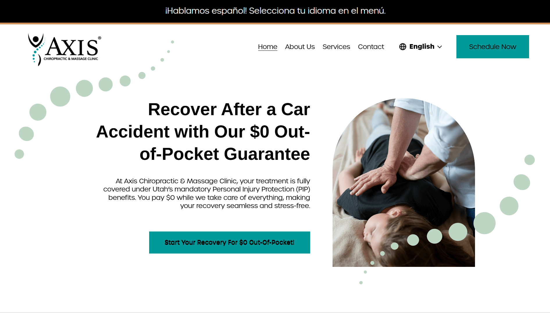
Chiropractor website hero section image optimization example
For example, this image uses the file name “massage-therapy-car-accident-recovery” instead of “edward-muntinga-Qcl0YqqGwus-unsplash” and I’ve added alt text that says “Chiropractic care after a car accident at Axis Chiropractic & Massage Clinic” in the image settings. The spine graphic images have also been optimized with a file name that includes the business name and alt text describing the design.
Learn more about how to choose the best images for your website and check out the Image Optimizer to help you write keyword-optimized file names and alt tags.
14. Write an Keyword Rich SEO Titles and Descriptions
Your design might look great, but if you skip the SEO optimization part of your website, you’re going to lose out on potential visitors and clients.
Ask Yourself: Do you have a keyword-optimized site title and meta description that share what you do?
Make sure to add a keyword-optimized title and meta description to each page of your website. Your homepage title and description should include your business name, the type of work you do, who you work with, and your location.
Site titles should be between 30-65 characters.
Meta descriptions should be around 105-150 characters.
Example SEO Titles
Functional Medicine MN | Minnesota Center for Functional Medicine
Car Accident Injury Clinic | Chiropractic Care in Salt Lake City
Natural Weight Loss – Medically Guided Solutions for Menopausal Women
Educational Consulting and School Placement | Crossbridge Education
Example SEO Meta Descriptions
Discover personalized health optimization at Minnesota Center for Functional Medicine. Specializing in root cause solutions, lab testing, and tailored wellness programs.
Axis Chiropractic & Massage Clinic provides expert chiropractic care and pain management for car accident injuries - all for $0. Book a free chiropractic consultation today.
Discover holistic weight loss programs for menopausal women. Virtual services for stubborn weight gain, metabolism resets, and customized meal plans. Available in NY, NJ, FL, CA.
We provide therapeutic educational consulting, school placement services, and IEP advocacy for children, teens, and young adults across the U.S.
Learn how I use Ubersuggest’s SEO Audit to improve my client’s SEO.
Is Your Website Working for Your Practice?
Is your website working as hard as you are? My free Website Homepage Audit helps health and wellness practices like yours determine if their online presence is effectively attracting new clients and complementing systems like Healthie.
Walk through the 16-point audit and see how your website scores, along with a few tweaks to your homepage can improve client conversion, streamline your online operations, and perfectly integrate with your EHR system.