Squarespace Button Styling
This post has been updated to cover the latest Squarspace update with Primary, Secondary, and Tertiary buttons. You can find the updated post here.
When designing a website on any platform, one of the most important design elements is having a call-to-action that stands out and makes people want to take action. Usually designers do this with buttons because visitors understand what a button is and whats going to happen when they click.
Squarespace has built-in button styles that you can change (depending on the template), but what if you want to go beyond that? Today I’m sharing 6 different styling options you can use for buttons on your website, whether you’re updating just one or all of them.

Before I share the actual code you’ll need to use to make changes to your buttons, let’s cover a few things first.
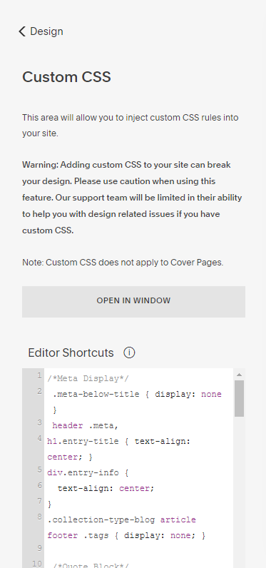
First, these changes can be made for a specific page by adding the code to the Pages > Page Settings > Advanced > Page Header Code Injection section or to the entire site by adding it to Design > Custom CSS. If you’re adding the code to one page, make sure to use the Style tag:
<style> Custom CSS Here </style>You can also apply to the code to a single button by using the button’s Block ID. You can find the Block ID using the Squarespace Collection/Block Identifier that I talked about in this post. To do this, add a button, turn the extension on, and click on the Block ID of the button you want to change. You’ll use this ID in the code below (I’ll tell you where to put it).

The second thing you need to know is that different button sizes have different names. In the code I’ll be showing you, I’m going to use a Medium button, but you can use a Small or Large button as well - just change" “medium” to “small” or “large.”
The third thing if a reminder to check your design on a mobile device before publishing changes. Sometimes updates like this will cause buttons to overlap if you change the width, so just make sure they look correct on mobile.
Alright, now for the styling updates!
Make buttons the same width (no matter the content)
If you’ve used buttons side-by-side or stacked on top of one another, you’ve probably noticed that the width of the button changes based on the amount of text inside. While this works when you just have one button, it doesn’t look as nice with different buttons together.
To solve this issue, you can make all the buttons the same width, no matter what the content is. One caution - if the content is wider than the button, it will force it to two lines.
To style your buttons this way, use the code:
.sqs-block-button .sqs-block-button-element--medium { width: 350px !important; }If you want to target a specific button, add the Block ID like this (you’ll need one for each button):
#block-yui_3_17_2_1_1585660121470_20002 .sqs-block-button-element--medium { width: 350px !important; }Update the hover color of a button
If you want the hover color of your button to be something other than a lighter version of the button color, you can do that with a simple update:
.sqs-block-button .sqs-block-button-element--medium:hover { color: red; background-color: yellow; }Don’t forget that you can target a specific button by adding the Block ID in place of “.sqs-block-button.”
Update the hover style of a button
You can also update the hover style of the button by changing the opacity or adding a different border:
.sqs-block-button .sqs-block-button-element--medium:hover { opacity: 1; border: 5px solid gray; } When updating the border, the 10px can be changed to adjust the width of the border. You can change the color name to match your brand colors. There are also many different options for the border style including solid, dotted, double, and inset. You can learn more about all the options here.
Use an image for your button
Want a totally different look for your button? You can actually make it into an image. This option is more advanced because there are more adjustments that you need to make, so you may have to play around with the numbers in the code below to get your image to show up as you want it to.
.sqs-block-button .sqs-block-button-element--medium { width: 175px !important; background-color: transparent !important; background-image: url("https://static1.squarespace.com/static/56afec9040261de47dbf7f92/t/5b197ed370a6ad6a7920d3e7/1528397523604/Button_Background.png"); background-size: 150px; background-repeat: no-repeat; background-position: center; color: gray; }In order to add the image as the “background-image,” you need to have a URL with the image. The easiest way to do that is to host the image on Squarespace. To do that, go to Design > Custom CSS > Open in Window.
Then, click on Manage Custom Files. You can drag and drop your image into the Custom Files section.

In order to have your image show up, highlight the exisitng URL, delete it, then click on the image you just uploaded. That will automatically add the new image’s URL. Then make any changes to the “width” and “background-size” and click Save.
Add more padding around a button
Sometimes you want to change the padding around the text of your button. This is a simple change you can make:
.sqs-block-button .sqs-block-button-element--medium { padding: 10px 25px !important; } You can change the padding in a few different ways. If you use only one number, the padding will be the same the whole way around.
In the code above, top and bottom paddings are 10px and the right and left paddings are 25px.
If you want every side to be different, you can control all four:
padding: 10px 20px 30px 40px;Here the top padding is 10px, the right padding is 20px, the bottom padding is 30px, and the left padding is 40px.
Update the overall styling of a button
If you want to make other updates, you can use these options to control the font (font-family), font color (color), font size (font-size), letter spacing (letter-spacing), and line height (line-height). If you want all the buttons on your website to have the same font, spacing, etc., I recommend making this changes in the Style menu, but if you only want to change specific buttons, then this code is for you:
.sqs-block-button .sqs-block-button-element--medium { font-family: georgia; color: white; font-size: 25px; letter-spacing: 0.5em; line-height: 35px; } Remember, for any of these update, you can add the code in three ways:
Target all the buttons on the website with Custom CSS
Target all the buttons on the page with the Page Header Code Injection
Target a specific button by replacing “.sqs-block-button” with the Block ID
You can always combine the above code options to build a button that really fits your brand.