Nutritionist Website Design for Neurodivergent Clients
Website Refresh Intensive
Nutritional
The Challenge: A Website That No Longer Matched the Practice
When Jackie from Nutritional reached out, the practice had evolved significantly—but the website hadn’t kept up.
What started as a smaller practice had grown into a well-established nutrition counseling business with multiple practitioners and plans to launch self-directed courses. But the website still felt dated, difficult to manage, and unclear for potential clients.
Jackie shared several concerns:
“The current website no longer reflects the reality of a well-established specialist practice.”
The existing website also created friction in the client journey. Inquiry forms weren’t collecting enough information, clients sometimes disengaged when referred to another dietitian in the practice, and the website structure wasn’t clearly explaining how the team worked together.
On top of that, the business serves a neurodivergent population, which meant the website needed to prioritize clarity, simplicity, and accessibility—not overwhelming design trends or cluttered layouts.
The Goal: Clearer Navigation, Better UX, and a More Professional Presence
Jackie booked a Refresh Intensive to create a website that better reflected the expertise of the practice while making the experience easier for both current and future clients.
The priorities included:
Modernize the design to feel more professional
Improve navigation and clarity
Better explain the team-based practice model
Prepare the website for future course launches
Improve SEO and search visibility
Create a more accessible experience for neurodivergent users
Improve inquiry and contact workflows
The Refresh: Strategic Design + Accessibility Improvements
Because the practice already had a strong brand foundation, the refresh focused on refining and expanding the existing visual identity while improving usability across the site.
Jackie wanted the design to feel clean, calm, and easy to navigate—without overly styled food imagery that could feel triggering for some clients.
What We Updated:
Refreshed the Home, About, Team, Services, and Contact pages
Added clearer explanations of the practice structure and practitioner roles
Improved user flow and next-step clarity throughout the site
Broke up large sections of text for easier readability
Simplified navigation and reduced visual overwhelm
Added more balance and flexibility to the existing color palette
Connected the website to a Practice Better contact form
SEO + Accessibility Work Included:
Keyword research and SEO optimization across all pages
Mobile optimization and responsive design improvements
Accessibility-focused design decisions for a neurodivergent audience
Reduced animation and visual distractions
Clear calls to action and simplified page layouts
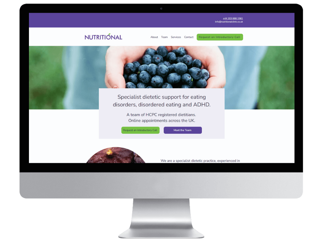
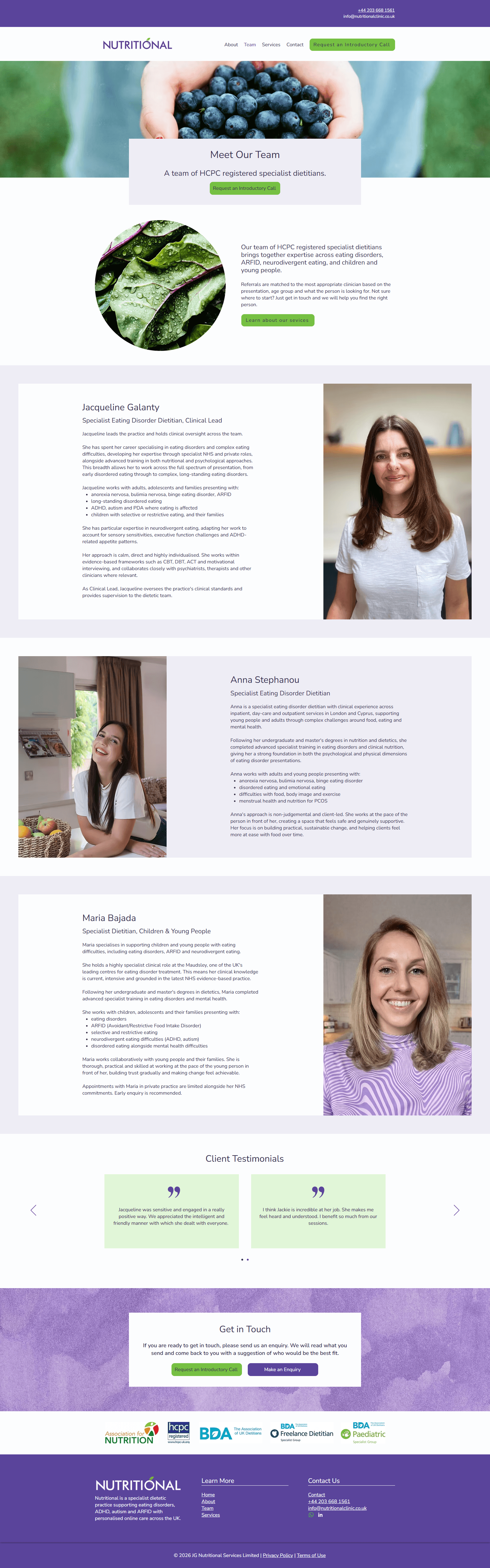
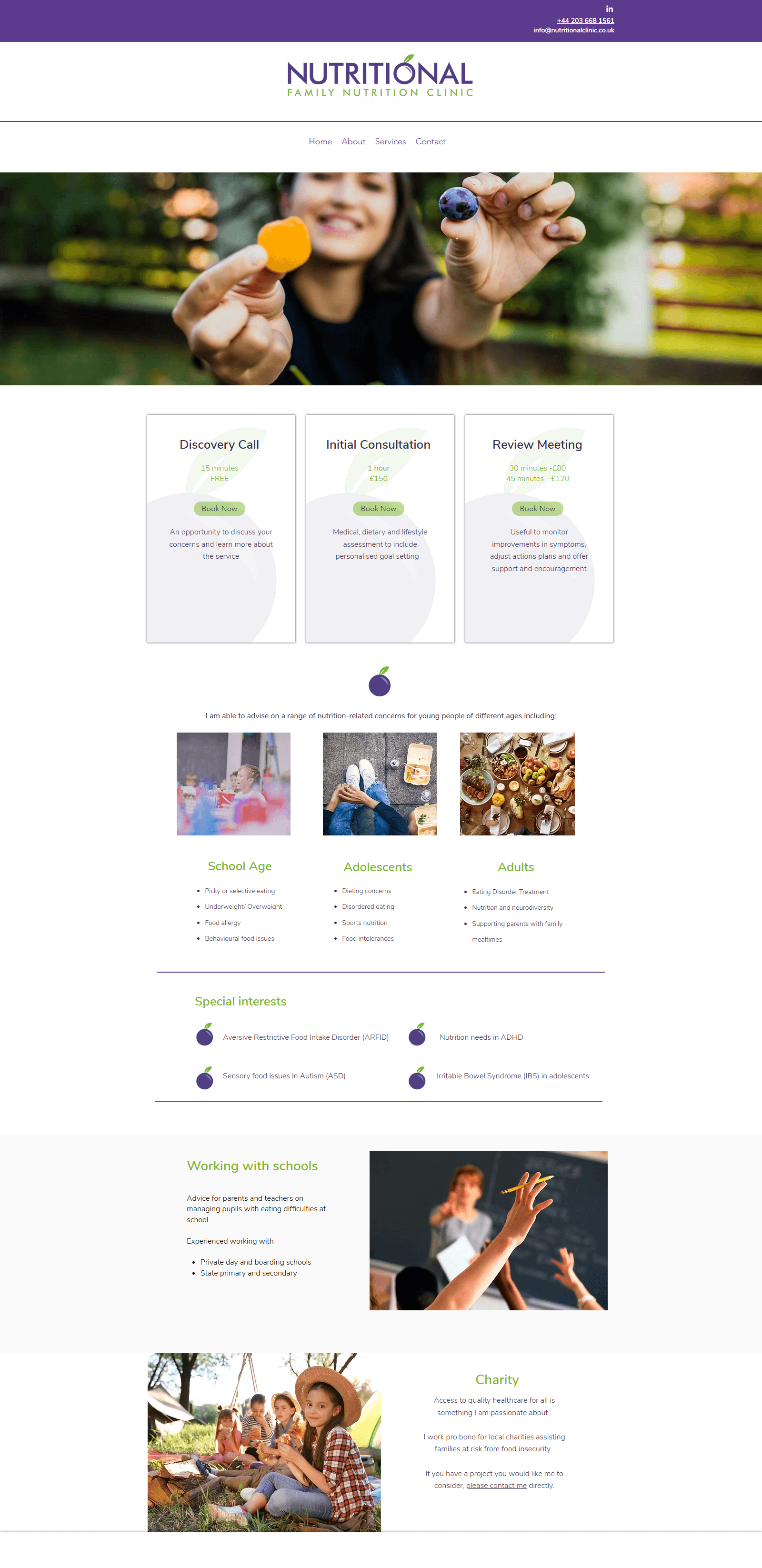
Homepage
Before
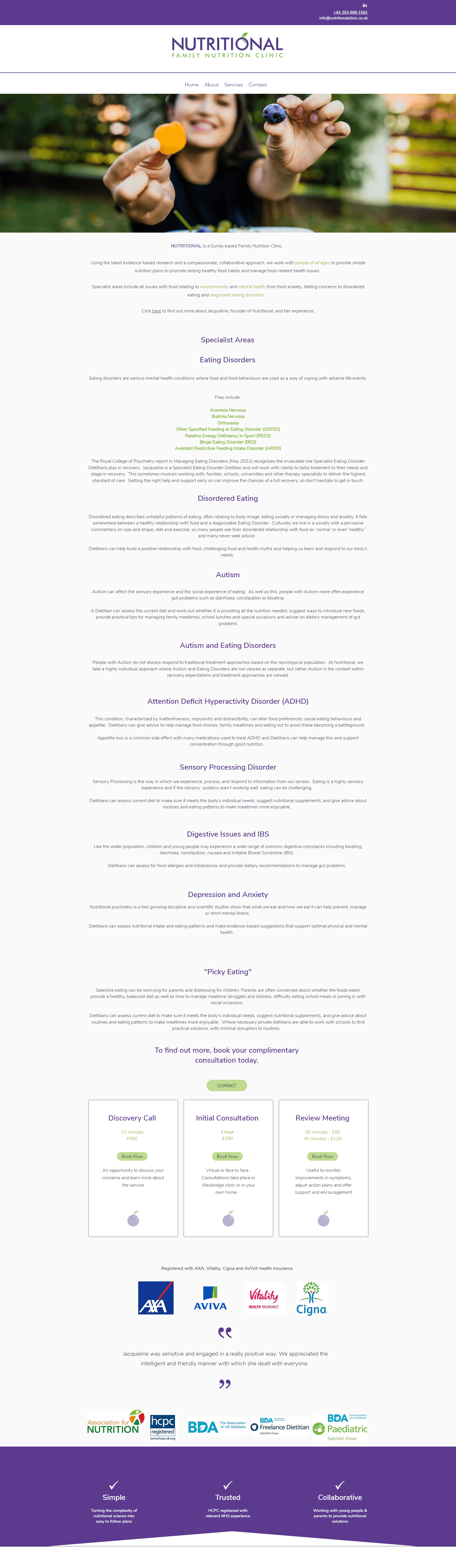
After
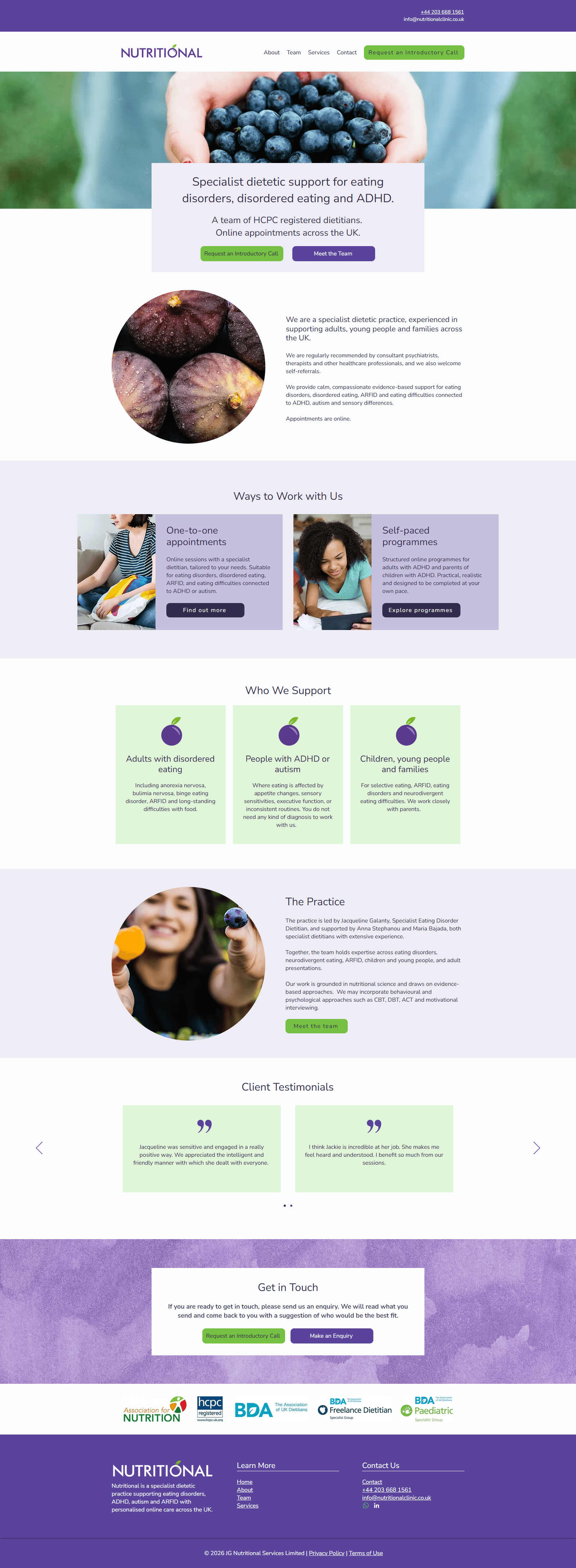
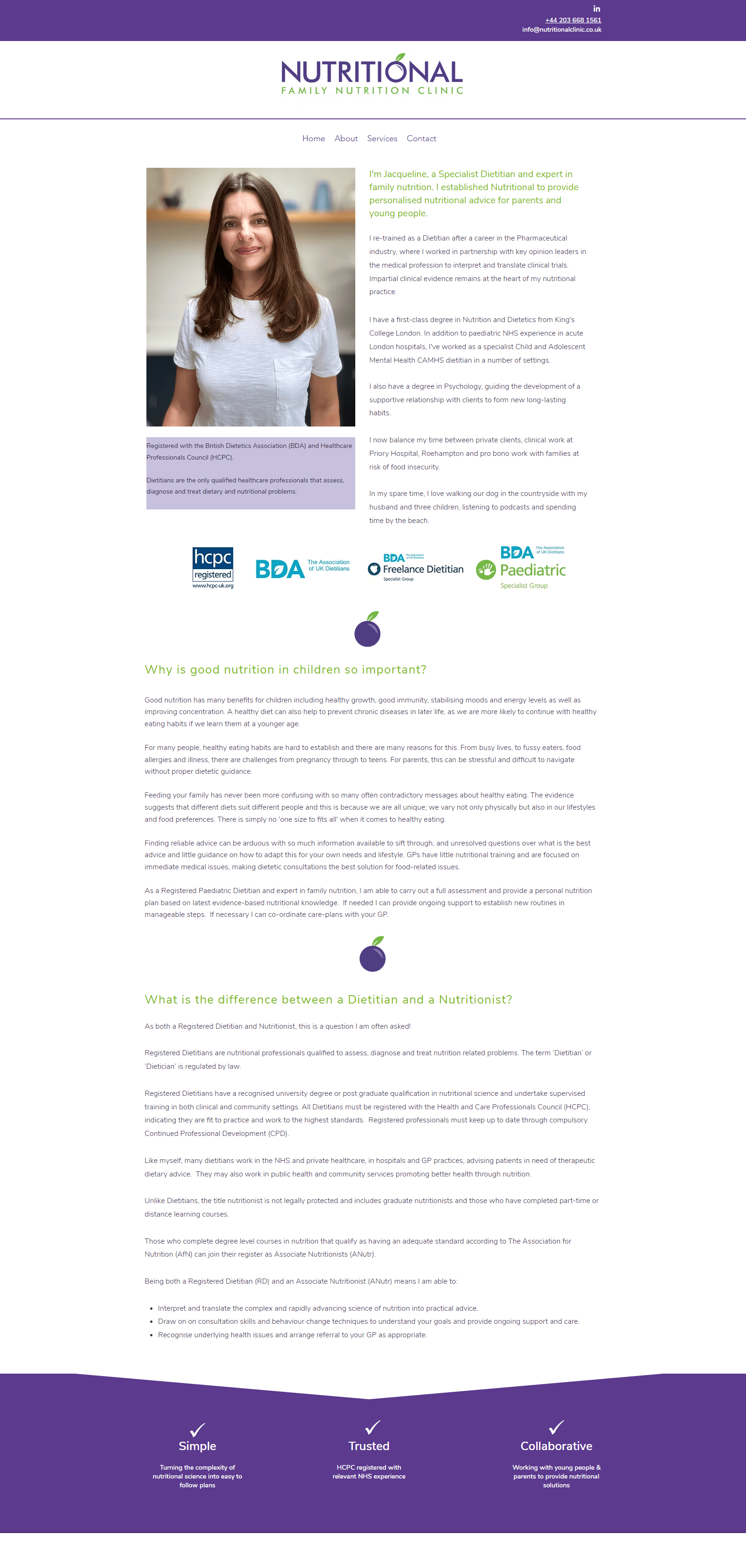
About Page Design
Before
After
Services Page Design
Before
After
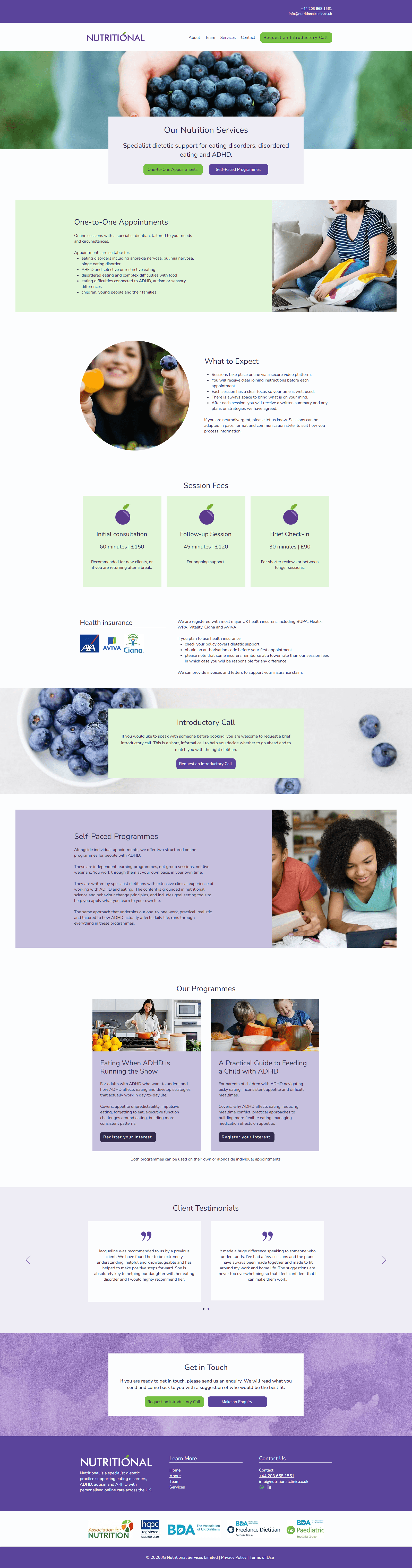
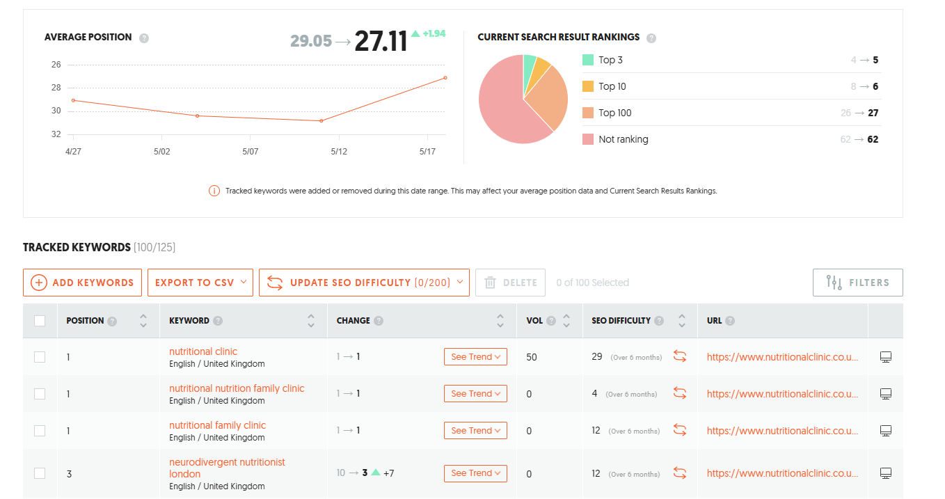
The Results: Better Rankings, Better Navigation, Better Experience
After launch, the refreshed website created a more polished and supportive experience for potential clients while also improving search visibility.
Outcomes Included:
5 keywords ranking in the Top 3
11 keywords ranking in the Top 10
23 keywords improved in ranking
Website visits increased by 14%
Organic search traffic increased by 10%
Jackie shared: “Thanks so much for all the work you did on the website. It’s looking a lot more professional and easier to navigate. I like the fact that the mobile site and desktop version work better for the way they are used.”
Ready to Refresh Your Nutrition Website?
If your website feels outdated, overwhelming, or no longer reflects the level of care you provide, a Refresh Intensive can help you create a clearer, more professional online experience that supports both your clients and your long-term growth.