The Importance of Custom CSS in Squarespace Design
When Squarespace first became popular and creative entrepreneurs starting using it to create their websites, it got a reputation of being a good platform, but always looking like a “Squarespace website.”
As a Squarespace designer, a big part of what I do is take the Squarespace framework and create something unique that doesn’t feel like just another Squarespace website that anyone could build.

When I recently redesigned my own website, I played around with even more customization and the ability to use Custom CSS to create something unique and beautiful. This current version of my website has almost 700 lines of CSS, plus Javascript, and on-page CSS updates.
If you aren’t a designer, those numbers and words mean nothing to you. So instead of just telling you that Custom CSS can transform your website, I’m going to show you two versions of my own site - one with all the customizations I’ve made and one using only Squarespace’s built-in design tools.
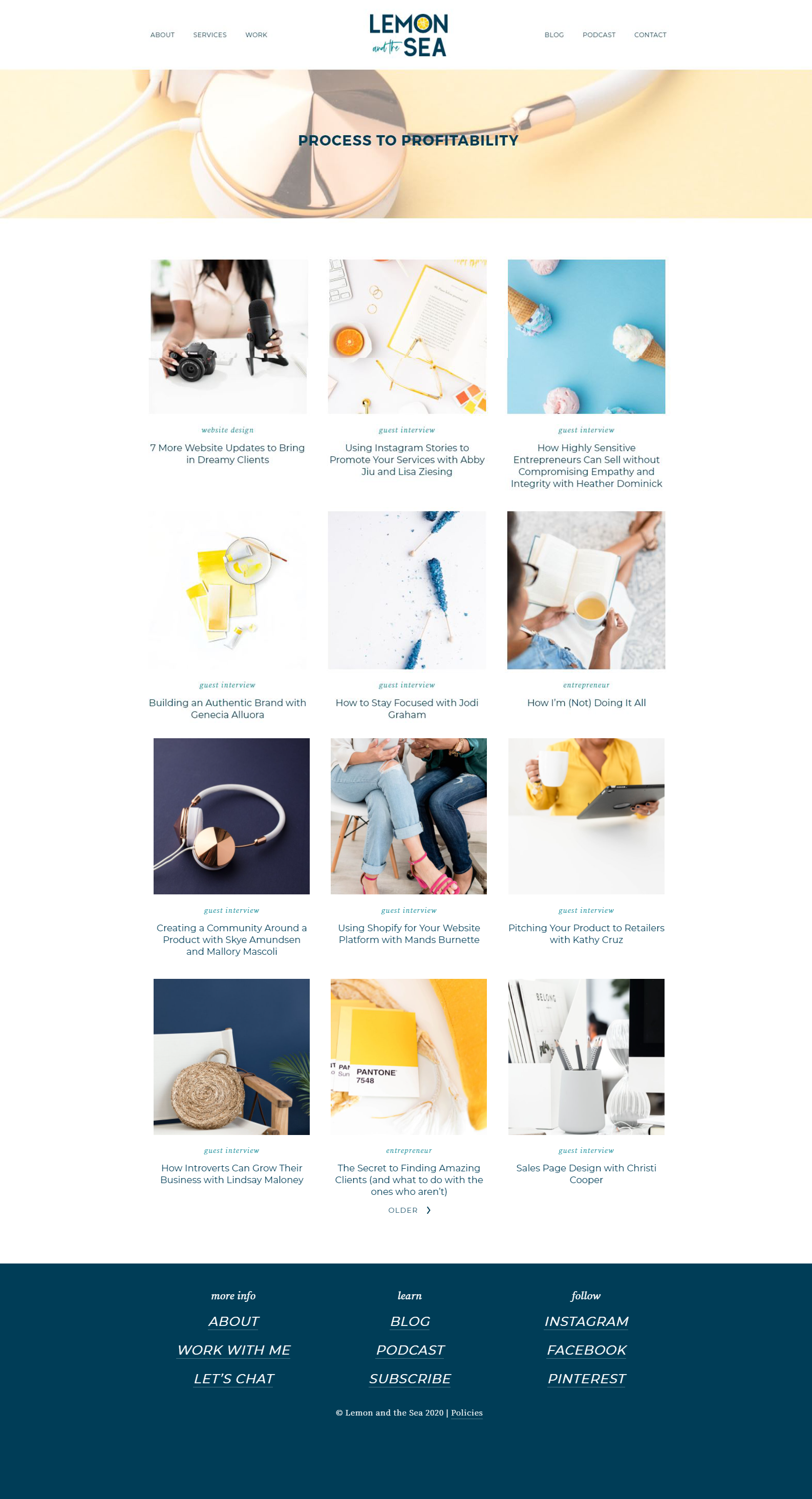
Homepage
The homepage of my website was the first page I mocked up. By creating a mockup in Adobe XD instead of designing right in Squarespace, I was able to think outside of the box and make changes quickly instead of spending time searching for solutions before I even knew what my site would look like when the design was finished.
The big customizations on this page include:
adding a pattern below the header image
inserting some fun lemon graphics on the side of the site
adding background colors to different sections
using a custom font and layout to create columns when sharing my process
adding full-width sections with text on one side and an image on the other
making the testimonials section stand out with a background color
adjusting the testimonial arrows to fit better with the design
tricking out the footer with a pattern, logo, and font choices
There are also updates you don’t see that make the website work better on mobile.
Before

After

About
The about page of my website is always the one I struggle with most (I think that’s true for most people), so the design took a while to perfect. I wanted to balance addressing my dream clients’ needs and sharing about myself.
Custom updates on this page include:
changing the headline color to be legible
adding patterns, icons, fonts, and background colors
alternating the color of the background on the card block images I used to share about my team/family
making the Instagram feed full-width and adding a IG button on top (similar to many Showit websites)
The custom elements here aren’t huge, but they make a big difference in the overall feeling of the website and tie this page together with the rest.
Before

After

Services
The services page is another one that many people struggle to design. It can be tricky to balance sharing enough information that your dream clients want to connect with you, but not overwhelming them. I’ve kept the main part of this page fairly simple to highlight the two main service types that I offer and share what’s included with each.
In order to communicate more information, but avoid making the page too long, I used accordions for an FAQ section. This allows me to share the most important information that most people need to know before setting up a call with me in a way that looks clean.
You’ll also notice that I include a base price for my services - there are different opinions on this, but I like to give visitors an idea of what my services cost to better target my dream clients.
Similar to the about page, many of the customizations here are to add visual interest and make the page feel on-brand:
adding patterns, icons, fonts, and background colors
using a custom font and layout to create columns when sharing my process
creating an accordion menu for FAQs
Before

After

Podcast & Blog
Both the Blog and Podcast pages on my site are created as Squarespace blogs and I made them look the same to keep things consistent.
Here I’ve added a few details to make the page easy to navigate and fit with the rest of the site:
adding a “Featured Post” section in the header with a border and background color
using buttons to make sorting through categories easier
customizing the category tag font, color, and underline
Before
After

Blog Posts & Podcast Episodes
Many people leave the actual blog post page alone because it isn’t as easy to customize. You can’t add a header image or extra sections, so it’s fairly stagnant as far as design is concerned. The changes I made here are about legibility:
increasing the paragraph font size
darkening the text color
changing the line height and letter spacing
These small changes don’t seem like much when viewing them here, but make a big difference when someone is actually reading through a long post.
Before

After

Mobile Menu
When it comes to mobile design on Squarespace, the platform does a pretty good job of translating the desktop version of a website into a mobile design. This is a huge plus - unlike Showit and other platforms, you don’t have to design your website twice or worry that it won’t be mobile responsive.
For mobile devices, I don’t make many updates because there isn’t much that can be changed. The most important thing to consider are making sure that all the custom CSS I’ve added to make the desktop site look right also work on mobile (and making adjustments when it doesn’t).
The other thing I like to customize is the mobile menu. In mine I’ve added quite a few fun details:
adding the pattern and logo to the bottom of the screen
adding the logo above the menu links
changing the link spacing
adding social media links
Before

After

The Importance of Working with a Designer
These pages are just some examples of the unique designs that can be created on Squarespace using Custom CSS.
If you’re working on your own website and want to make it unique, I always recommend hiring a designer who is familiar with Squarespace so that you can achieve a website that reflects and elevates your business.
When searching for a designer, take the time to get recomendations from trusted friends and colleagues, but also make sure to look at their previous work. This gives you a picture of what their design style is like (not every designer can do every style well).
When interviewing designers (yes, you should do this), make sure to ask about their process to see how they work with Squarespace and how comfortable they are with making updates with CSS. You don’t need to quiz them - just make sure they know how Squarespace works so they can design without being constrained by the basic Squarespace box.
If you’re looking for someone to help you design or customize your website, check out my services to see if we would be a good fit.