A Step-by-Step Guide to Designing Your Website Homepage: Exactly What to Include With Design Examples
Let’s be honest: your homepage can make or break whether someone actually reaches out or clicks away. When it’s done right, your homepage works like a friendly front desk — welcoming people in, showing them where to go, and helping them feel confident that they’re in the right place.
But most health and wellness websites either overwhelm visitors with too many choices, or leave out the details people are looking for. That’s why I’m breaking down exactly what to include on your homepage, plus simple design ideas you can follow — whether you're DIYing your website or refreshing it with a designer.
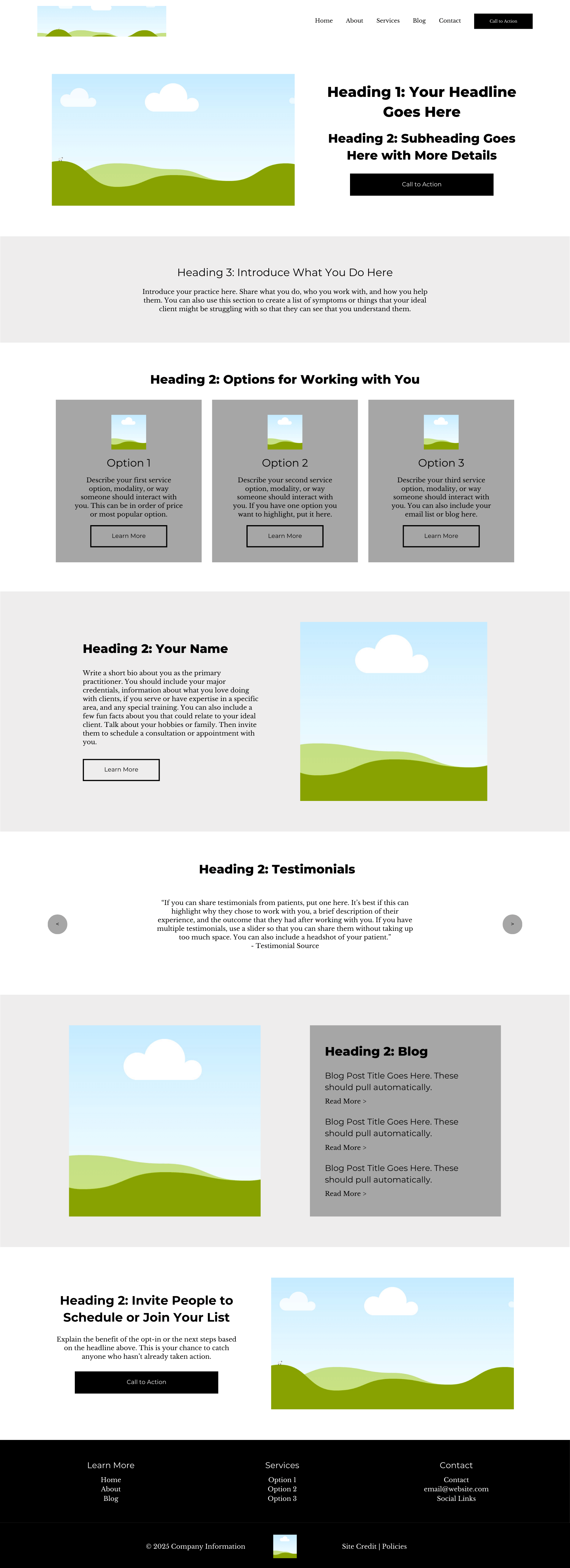
Home Page Sections with Examples
Each section on your homepage serves a purpose — it’s not about adding more, it’s about adding the right pieces. This is how you turn curious visitors into confident clients: you guide them through exactly what you do, who you serve, and how they can work with you.
Here’s a breakdown of each homepage section — what to include, why it matters, and examples of how you can design each piece to fit your practice and your brand.
Hero/Headline
The goal of your hero section is to capture attention and let visitors know that they’re in the right place.
Instead of a generic headline that says nothing about what you do or who you help, your headline should tell me what you do, who you do it for, and why I should choose you over every other practice.
Your subheading should expand on exactly what you do, who you work with, and where you’re located.
You also need to have a call to action button in the hero section and not just in your menu.
Introduction
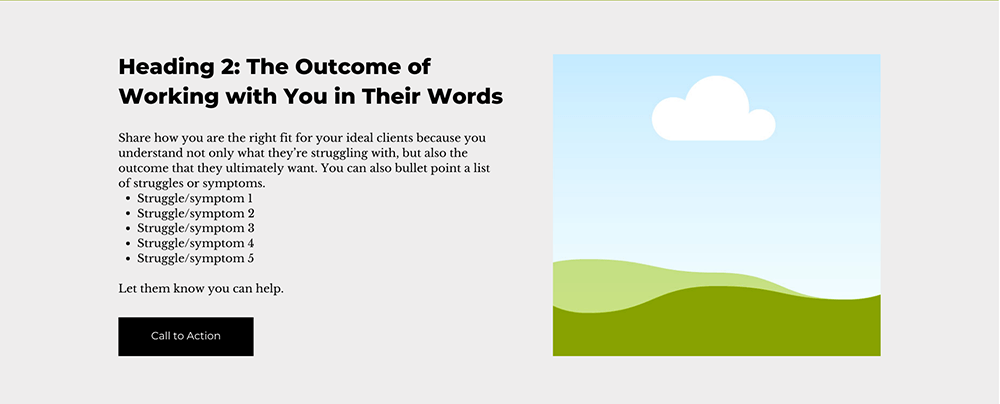
Introduce your practice here. Share what you do, who you work with, and how you help them. You can also use this section to create a list of symptoms or things that your ideal client might be struggling with so that they can see that you understand them.
Choose Your Own Adventure
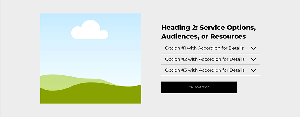
There are a few options for this section depending on how your business is structured.
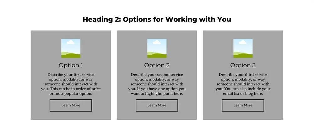
Options for Working with You:
Describe your first service option, modality, or way someone should interact with you. This can be in order of price or most popular option.
Describe your second service option, modality, or way someone should interact with you. If you have one option you want to highlight, put it here.
Describe your third service option, modality, or way someone should interact with you. You can also include your email list or blog here.
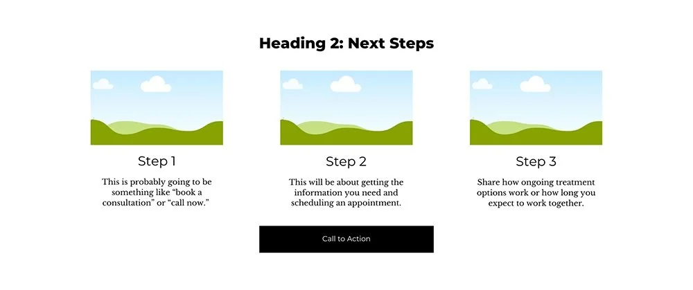
Next Steps:
This is probably going to be something like “book a consultation” or “call now.”
This will be about getting the information you need and scheduling an appointment.
Share how ongoing treatment options work or how long you expect to work together.
Bio
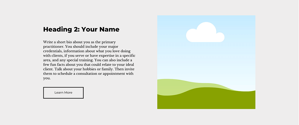
Write a short bio about you as the primary practitioner. You should include your major credentials, information about what you love doing with clients, if you serve or have expertise in a specific area, and any special training. You can also include a few fun facts about you that could relate to your ideal client. Talk about your hobbies or family. Then invite them to schedule a consultation or appointment with you.
Testimonials (optional)
If you can share testimonials from patients, put one here. It’s best if this can highlight why they chose to work with you, a brief description of their experience, and the outcome that they had after working with you. If you have multiple testimonials, use a slider so that you can share them without taking up too much space. You can also include a headshot of your patient.
Blog/Resources/Additional Information
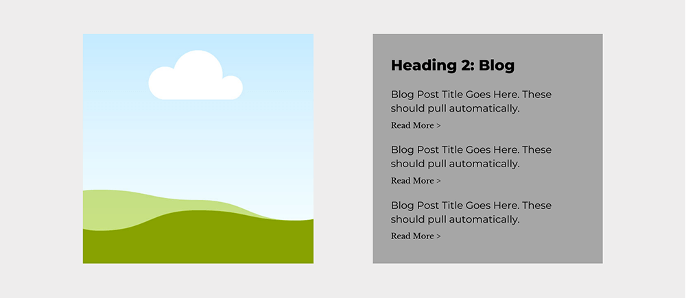
If you have a blog or any resources that you share with your email list, include a section on your homepage that includes either the most recent or most popular posts (or resources).
Final Call to Action
Keep this final section of your homepage simple with a heading, description, and button. I like to put these on a colored background or image to help it stand out and make it clear that this is what you want someone to do before they leave your site.
Footer
Include all the important links from your website including:
Your logo or business name
Links to main website pages (in the same order as on the main menu)
Social media links (either text or icons)
Contact information including email, address, phone number, or link to contact page
Newsletter opt-in form (optional)
Copyright information
Link to policies
How to Customize Your Homepage Layout
There’s no one-size-fits-all homepage. Once you know which sections you need, you can mix, match, and arrange them to fit your services and your clients’ decision-making process. Your homepage should feel like your practice — simple, intentional, and clear.
Here’s how to pull it all together, so your homepage flows naturally and helps every visitor find the right next step.
👉 Want to see how this looks in real life? Check out my portfolio to see examples of health & wellness websites I’ve designed for my clients.
Tips for Designing for Website Homepage
You don’t need to be a designer to make your homepage look polished — but a few small choices can make a huge difference in how your website feels to visitors. And when your website feels professional and easy to navigate, people are more likely to stick around, trust you, and take action.
Here are a few design tips to help your homepage look great, stay on brand, and most importantly — convert visitors into patients.
Headlines: Your first headline should be set as H1 (or Heading 1) and be at the top of your website. From there, you will use Headings 2-4 in descending order.
Fonts: Choose 1-2 fonts to use throughout your design. I like to have my headline in one font and use another for subheadings
Buttons: Your CTA button needs to stand out. Use a bright color that compliments but doesn’t blend in with the images and other font colors.
Text over Images: Make sure your copy is legible by choosing background images that don’t hide the text. Or add a colored block behind any text that’s over an image.
Ready to create a website that gets more patients into your office?
Apply now for a One-Week Website Design and get results in just one week.
Just like my client Sara who moved away from her drab, old-fashioned WordPress site to a Squarespace website that captured her personality and spoke to her dream clients. “I am so excited, thank you so much. I really can't tell you how much more ‘me’ this website is and how much better it is. I love the whole layout of this. I love the colors. Honestly, I think you've done a fantastic job of really getting the colors that I love and that go with my brand.”

