How to Choose an Accessible Color Palette for Your Practice’s Website
One of the most common mistakes I see when visiting websites is that they don't meet basic accessibility standards.
This includes websites that I'm reviewing, those I'm helping clients with, templates I've been asked to look at, and even the sites I'm visiting myself.
According to WebAIM's 2024 report, 81% of home pages had low contrast text that fell below the WCAG AA guidelines.
81% of websites are losing traffic, missing out on potential buyers, and at risk of being involved in a lawsuit (the ADA.gov website actually states that "Web Accessibility for People with Disabilities is a Priority for the Department of Justice.").
And beyond avoiding being sued, creating an accessible website shows that you value all people, something especially important for health and wellness practices.
The easist way to make sure you’re creating an accessible website
One of the easiest ways to make sure you're creating an accessible website is by choosing a color palette that includes lots of high contrast options for backgrounds and text.
I just worked with Sage Rountree, a yoga instructor and teacher. During her 90-minute Refresh session, I helped her choose a color palette that had more accessible color combinations and would make navigating the site easier (and look better).
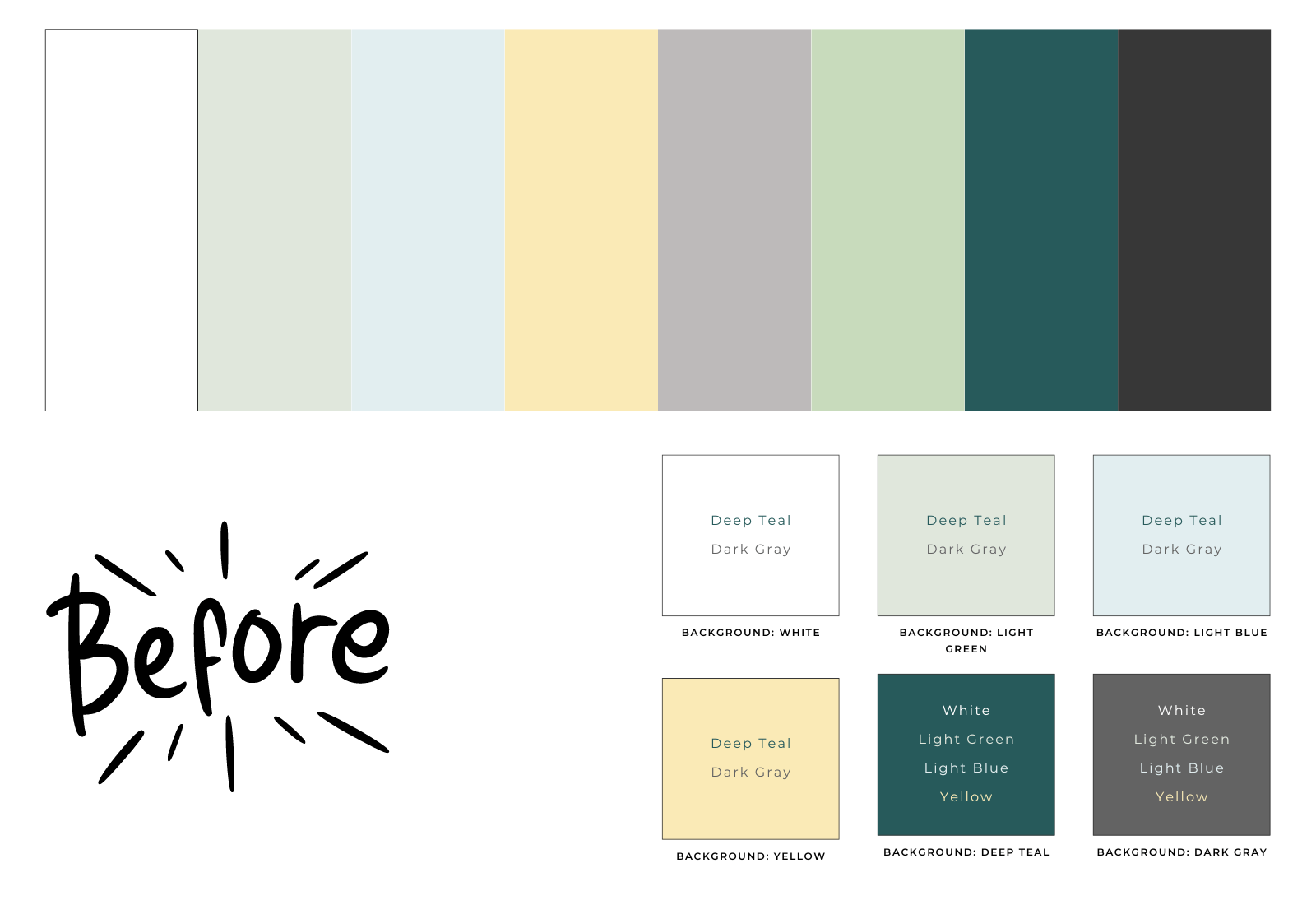
Before:
most colors were light
they were muddy when placed next to each other as section backgrounds
2 colors could only be used with images as they didn't have any accessible color combos in the palette
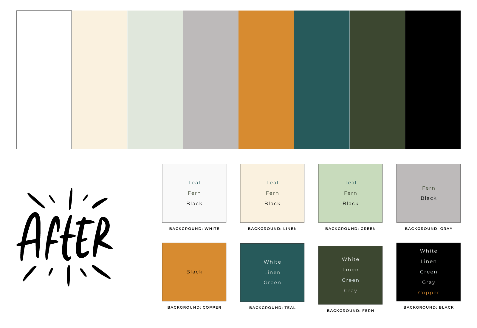
After:
added a variety of neutral, light, and dark colors
every color has at least 1 accessible color combo
work well together throughout the brand
easy to use as section backgrounds to add interest and highlight important parts of the page
By changing 4 of the 8 colors, I was able to give Sage a much more usable color palette that helps her site to stand out and showcase all her amazing work.
Even website templates aren’t using compliant colors
This color palette was pulled from a popular template shop and was designed to be light and natural.

Before:
most colors were light
while this looks good as a palette, it only allows for light backgrounds
the assumed button color (orange) isn’t compliant with any other colors

After:
dark gray was changed to solid black which allowed the orange to be used as a button
adding purple allowed for more heading colors on the light backgrounds and another button option
By changing one color (gray to black) and adding one more bold color, this is a much more usable palette that still keeps the same aesthetic.
How can you make sure your color palette is WCAG compliant?
According to WCAG, “WCAG 2.0 level AA requires a contrast ratio of at least 4.5:1 for normal text and 3:1 for large text” and “large text is defined as 14 point (typically 18.66px) and bold or larger, or 18 point (typically 24px) or larger.”
I love using WebAIM's Contrast Checker when checking a few colors because it's easy to use and make adjustments. When designing and choosing colors for my client websites, I use Coolors.co to get started with ideas and The Color Palette Studio’s Color Palette Tester to finalize my choices and easily see all the compliant pairs together.
Color contrast is a great starting point for web accessibility as you usually just have to make a few adjustments.