How Choosing the Right Images Can Change Your Site Dramatically

The photos and color palette you use on your website make a huge difference in the overall feeling that your site conveys to visitors. That’s why it’s so important to know your brand’s look and feel before starting on a site design project.
The color palette of your website may vary slightly from your brand colors – usually I have to add a black for body copy and a neutral for other basic elements – but it should reflect your brand design and the feeling you want to convey to visitors.
In this post you’ll see how the exact same design changes drastically based on the images and colors used. Each of these designs has the same layout and the same base color palette of Navy, Forrest Green, and Black. I’ve only replaced the images, changed some of the accent colors, and adjusted the font colors where needed for visibility.
All of these images are from Unsplash, a free stock photo website with thousands of images to choose from in all different categories. When choosing the photos used in these designs, I create three different feelings that I wanted to convey and found images to fit each.
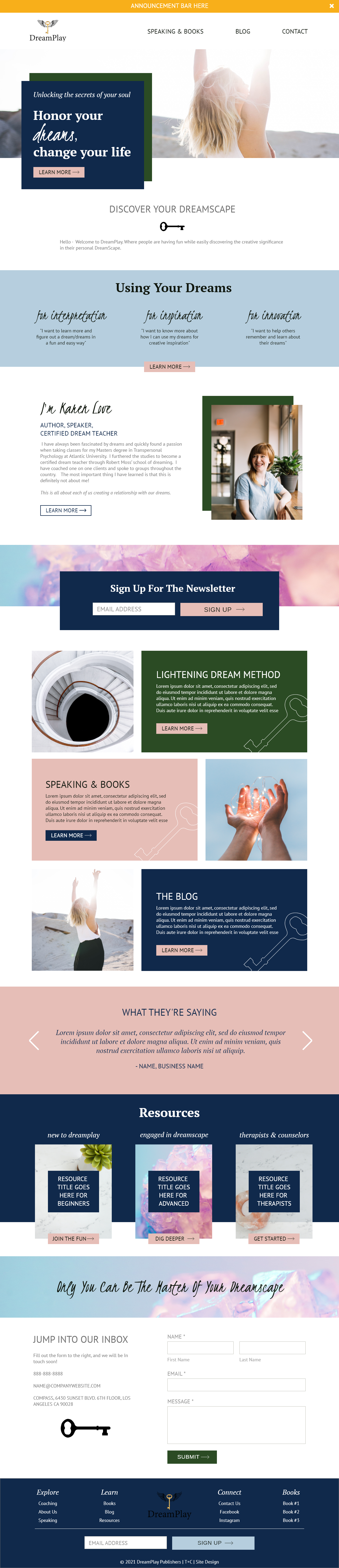
Concept One: Dreamy
The concept here is light and movement. Through images that play with light and haze, we bring the idea of dreaming.

Option Two: Vibrant & Lush
The concept here is a lush, vibrant landscape filled with color and greenery. We can play with textures as backgrounds.

Concept Three: Light Play
This concept has more of an airy feel, playing with patterns and light, balancing white space with bold colors.

Below I’ve translated these three different options onto the same site design.
Option 1

Option 2

Option 3
From the above examples you can see what a big difference a few accent colors and image choices make when designing your website.
If you want more information about finding, choosing, and optimizing images for your website, check out this episode of Process to Profitability.