Improving User Experience on a Healer’s Website with an Accessible Design
Website Refresh Half-Day
Writer, Poet, Energy Healer, Dancer
The Challenge: Making an Energy Healer’s Website User-Friendly and Accessible
Cheryl Pallant, a published author and wellness professional, was struggling with her existing website on Divi. Her primary issues were an unorganized homepage, a lack of dedicated pages for her books, a complicated navigation menu, and a color palette that did not adequately reflect her brand or meet the WCAG color contrast guidelines. Cheryl hired me to address these challenges and help make her website more user-friendly and visually appealing.
“I knew my DIY website was *OK*, but it wasn't super professional and I knew it could be way better. I also knew that there were limits to what I could do and didn't have the time or motivation to figure it out myself.”
Before

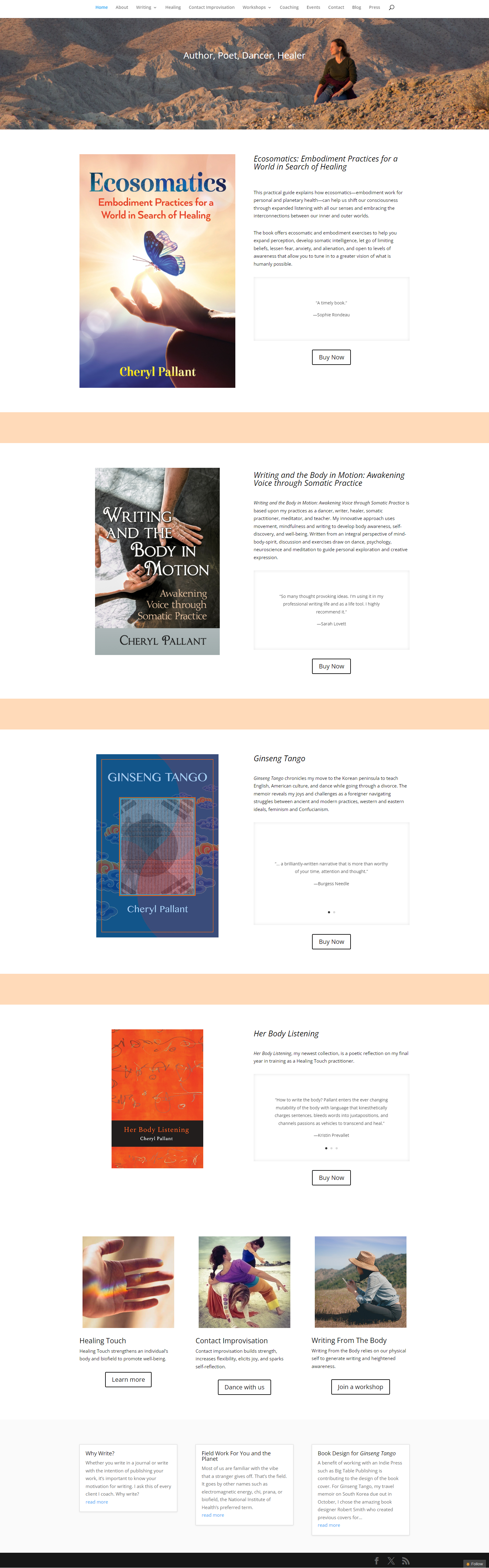
After

What We Did: A Refresh Session for Cheryl Pallant’s Healer Website Design
During our 90-minute refresh session, we focused on the following key areas:
Homepage Redesign: We restructured Cheryl's homepage to make it more organized and engaging. This involved rearranging elements for better flow and emphasizing key sections to highlight her work and achievements.
New Book Pages: We created dedicated pages for each of Cheryl's books. These pages included detailed descriptions, reviews, and purchase links, providing visitors with comprehensive information about her publications.
Menu Organization: We reorganized the website's menu to simplify navigation. This included grouping related items together and creating clear, intuitive pathways for users to find information.
Color Palette Update: We updated the website's color palette to better reflect Cheryl's brand identity and ensure compliance with WCAG color contrast guidelines. This not only improved the site's accessibility but also enhanced its overall aesthetic appeal.
Before
After

The Outcome: A User-Friendly, Accessible Website for an Energy Healer
The transformations resulting from our session were significant and had a positive impact on Cheryl's website and business:
Improved User Experience: The homepage's new structure made it easier for visitors to find and engage with content, resulting in longer site visits and increased reader interaction.
Enhanced Book Promotion: The new dedicated book pages provided a professional showcase for Cheryl's publications, likely boosting sales and reader interest.
Simplified Navigation: The reorganized menu improved site navigation, reducing user frustration and helping visitors find the information they needed quickly and efficiently.
Brand Consistency and Accessibility: The updated color palette not only reinforced Cheryl's brand identity but also made the site more accessible to all users, including those with visual impairments.
Overall, Cheryl's refreshed website now better reflects her brand and provides a more pleasant and efficient user experience. These improvements have helped her to better connect with her audience and promote her work more effectively.
Ready to transform your website?
When you’re ready to transform your website into a welcoming design that builds trust and converts your right-fit leads into clients, my One-Week Design Experience is the perfect way to update your website without it taking weeks or months to launch.
With my one-week process, I’ll create a custom design that reflects your brand and is ready to launch in just one week.