A Designer's Quick Guide to Choosing Fonts for Your Website
Ever wonder what fonts you should use on your website? Overwhelmed by all the options and not sure how to set up headlines, sub-headings, and body text. Need help pairing fonts together (and don’t want to pay a ton)? This quick guide goes through everything you need to know about choosing fonts for and using them on your website.
What You Need to Consider When Choosing Fonts
Your brand
When choosing fonts for your website, you should first look at your brand. If you’ve worked with a designer, they’ve probably chosen fonts for you to use that will work on the web as well. This is always a great place to start.
If you don’t have a font palette for your brand or if the fonts you’ve used in your logo aren’t available for web, you’ll need to choose other options.
Think about your brand voice - are you friendly or formal, casual or corporate. This will help you choose your fonts because you want them to amplify the message that you’re communicating in your copy, images, and branding.
Not sure which fonts are casual and which are corporate? There are lots of resources to help you without the need to understand all the details of typography design, but if you start with a solid lists of fonts, you can generally choose any one that appeals to you and end up with a good design.
Legibility
Even more important than having a font that matches your brand is having one that’s easy to read on the web. Many fonts that are used in logos, especially handwritten and script fonts aren’t legible when trying to write paragraphs and headlines, so you’ll only use those as accents.
Instead, you want to choose a clean serif or sans serif font that’s easy to read in long paragraphs. Not sure what to choose? Check out the list of fonts below to see some options.
If you’re using a website template as a base, you can look at the fonts they are using as a starting point, as any good template will include legible fonts.
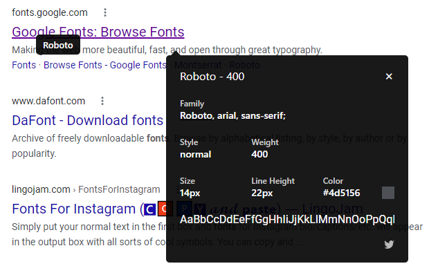
Another option is to find some well-designed websites that have branding similar to yours and see what font’s they’re using with an extension like WhatFont for Chrome. Then you can either use the same fonts or find some that are similar, but free.
Tip: never use a display font for body copy. They are designed for headings and large text and won’t be legible in smaller sizes.
Versatility
When choosing a font, you want something that gives you a wide range of options. Take a look to see if they include multiple font weights (not just a bold version) and italics.
If a font only includes one weight or is all in uppercase, it’s not using to be a versatile option for your website.
Availability on Squarespace
If you’re using Squarespace for your website, your best bet is to choose a font that’s also available in Squarespace’s built-in design panel. This will mean your fonts load faster and you don’t have to add them yourself with CSS.
Paige Brunton has an in-depth post about fonts available on both Squarespace and Canva that is a great resource if you use both for your business.
Choosing & Pairing Fonts
When choosing fonts, you should always begin with your body text. This is going to make up the majority of the copy on your website, so you want to pick this first and then choose headlines fonts to match.
You should only choose 1-2 fonts for your website. You can use only one font if you vary it using italics, uppercase, size, and color without worrying about pairing the right fonts together.
If you are going to choose two fonts, always pair a serif with a san serif.
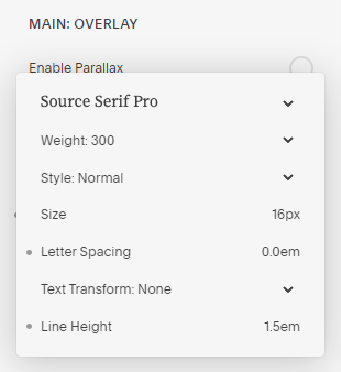
Not sure how to pair fonts? Find a super family that includes both a serif and sans serif (like Source Serif Pro & Source Sans Pro). They’re designed to work well together and you never have to worry about them not fitting.
Tips for body text
So you know you need to choose your body font first, but how should you use it?
First, use a font designed for reading. This will make your job much easier because it’s already set up to be legible in long paragraphs.
Set your line height around 1.5. You won’t need to go higher than 1.5, but will occasionally use a line height as small as 1.25. If you’re in that range, you can go based on what looks best to you.
Always use normal, book, or medium weight for body copy. If you’re choosing a number instead of a label, stick to 400 - 500.
Don’t add letter spacing to body copy. A well-designed font already has the letter spacing built-in, so you can go ahead and set it to 0.
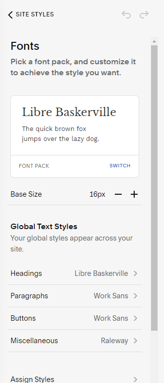
If you’re using Squarespace 7.0, you’ll adjust all these settings in the Design > Site Styles panel. There will be options for paragraphs and each heading types (1-3).
In Squarespace 7.1, there is a Fonts sub-menu under Style Settings that will include all the paragraph and heading types.
Tip: body copy should always be a minimum of 16px.
Tips for headlines
When creating your headlines, you should choose a larger font size. If you’re using multiple heading types, each should get larger than the previous. The easiest way to choose your font sizes is to use the standard size increments (you’ll see this in any Word type program): 12, 14, 16, 18, 20, 22, 24, 26, 28, 36, 48, 72. You’ll notice that the larger the font, the greater the increase. This gives you the most bang for your buck and really differentiates between different heading styles.
Unlike body copy, you can use display fonts for headings. These generally have more detail and aren’t as legible at smaller sizes.
When using a larger font size, you should also add more letter spacing and can lower the line height. Much of this will be done by eye as you’re designing, but a good rule is to use a line height around 1-1.25 (sometimes less than 1 as long as the lines don’t butt into each other) and a letter spacing of 0.5-1.
If you want your headlines to blend with your paragraphs so they look like they go together, you should also use a lower font weight or a lighter color so that your headlines don’t completely overwhelm your body copy.
For added variation in headlines, you can also use all caps as long as it’s not for long lines of text. Usually this is used for menu links, sub-headings, and labels.
The Best Free Fonts
Need some ideas for fonts to use on your website without spending hundreds of dollars? This list includes some of the best free font options available.
Most of these fonts are available for free from Google Fonts, but there are some from other sources as well. The fonts with an asterisk are already built into Squarespace, which makes them even easier to use.
Serif and Slab Serif fonts
PT Serif* (offers caption, extended, and narrow versions)
Playfair Display* (headlines only)
Sans Serif fonts
Fira Sans* (offers compressed and condensed versions)
Great Font Pairings
Now that you know more about choosing a font and you’ve picked your body font (remember, pick this first), you can now choose a heading font to pair with it. These are some pairings that I love.
Source Serif Pro & Source Sans Pro (super family)
Roboto Slab & Roboto (super family)
Alegreya & Alegreya Sans (super family)
Merriweather & Merriweather Sans (super family)
Playfair Display & Fira Sans
Montserrat & Source Serif Pro
You can also find lots of graphics to help you choose font pairs on Pinterest by searching for font pairing and the platform you’re using.
Resources for Typography and Fonts
Want to learn more about typography or find other free fonts? Check out these resources.
Typewolf - for font pairs, example of fonts in use, and resources for typography - specifically The Definitive Guide to Free Fonts and Type Pairing Lookbooks
Learn UI Design Blog - for in-depth typography advice
Google Fonts - for free fonts, some are great while others should be avoided
Fontshare - for free, high-quality fonts
Font Squirrel - for free fonts, some are great while others should be avoided
Adding a Custom Font to Squarespace
If you’ve gone through the list of free fonts above and don’t find anything you like or if you’ve invested in purchasing a font that isn’t built into Squarespace, it is possible (and fairly simple) to add a custom font.
1. Find the font file you want to use. You’ll need to have it on your computer.
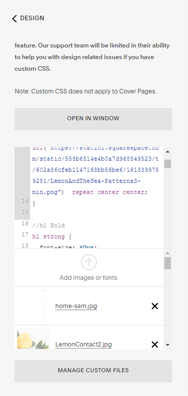
2. Upload the font to Squarespace in the Design > Custom CSS > Manage Custom Files.
3. Name the font by adding the following code to the Custom CSS panel. Use the URL created by the font file you just uploaded.
@font-face {
  font-family: FontName;
  src: url("URL.ttf");
 }
4. Set where the font displays. This can be h1 for Heading 1, h2 for Heading 2, h3 for Heading 3, or p for Paragraph text. You’ll need to use the same formatting you set for the font name above.
h3 {
   font-family: FontName;
 }
5. Make any necessary adjustments to the font.
h3 {
   font-family: FontName;
   font-weight: 300;
   font-size: 28px;
   letter-spacing: 1em;
 }
I hope this helps as you’re choosing fonts for your website! It may seem like you’re spending lots of time on little details, but the right fonts with the right settings will make a big difference in how legible your website is and how well you’re communicating your brand message and values.